library(tidyverse)
library(feather)
library(plotly)
library(reticulate)
library(iodDownloader)
source('../utils/data_processing.R')

# Time series libraries
library(fable)
library(tsibble)
library(feasts)
library(tsibbledata)
library(fabletools)
library(modeltime)
library(timetk)

# Formatting and communication
library(rmarkdown)
library(quartoExtra)
source('ggplot_themes/ggplot_theme_Publication-2.R')

# Setup quartoExtra
darkmode_theme_set(
  dark = theme_dark_blue(),
  light = theme_Publication()
)

# Statistical inference
library(BEST)Iowa Liquor Sales: 2.0+1.0 You are (Not) in a Pandemic

About this project
Here we will explore the data set “Iowa Liquor Sales,” which is freely available. The scope of this analysis is intended to make an Evangelion reference as first exploration of the data resources of the Iowa Open Data Platform. First, we will conduct a basic data exploration process, and then we will use statistical inferences to answer two specific questions:
Can the diversity in our inventory increase the sales of our store?
Did the pandemic increased the alcoholic intake of alcohol in the population?
You can take this as a history I tell with the data at hand, but also as a tutorial of some things that can be done using time series data. So please do not hesitate in using the code below in your professional/personal projects. Also, if you have any feedback I will be happy to receive it :)
Feel free to check the source code for this analysis in the GitHub repo. Probably the most useful for you will be the Quarto file.
About the data set
The data set we will be using contains information about the purchase of spirits made by grocery, liquor, and convenience stores, including supermarkets. This data is provided by the Iowa Open Data Platform and is constantly updated. It includes item descriptions and geospatial data, and is licensed under Creative Commons, which means that its use is less restrictive than other types of data. However, it’s important to note that the data only includes purchases of spirits, and does not include beer, wine, or moonshine purchases. Therefore, we do not have a complete picture of alcohol consumption.
If you plan on running an analysis using this data set, I recommend using a machine with at least 32 GB of RAM, as the data is around 12 GB in size. No GPU will be required for this task.
About the tools used
The chosen analysis tool was the R language for statistical computing alongside the Tidyverse ecosystem. Because it’s free, open-source, and one of the most powerful tools available for this purpose. Also, we can guarantee the reproducibility of the analysis/solution with this methodology.
This web page was generated with Quarto. Here, we have the code and a narrative backed by our results, all in the same document. Great for auditing processes! And also for the result presentation.
For instance, if I made an error during the analysis, you can easily keep track of what happened and why. Similarly, if we achieved excellent results, the same code can be reused in the future.
Libraries
We will begin by setting up our R environment.
Get the data, and some performance considerations
I’ve written an R package to facilitate the download from the Iowa Open Data Portal; Please check iodDownloader GitHub page for more details on the data pull. The package can be installed with:
# Uncomment below lines if you want to install iodDownloader
# install.packages("devtools")
# devtools::install_github("jospablo777/iodDownloader")
We will download the data only once since, from now on, there will be a local copy of the data to speed our affairs. You can find the data set page here. With the function download_iowa_data, the data will be downloaded in batches since downloading such big data sets can be troublesome or even impossible.
There is also another function, read_iowa_data, to read the batches into a single data frame. Since I worked for several days developing this analysis, I also saved a copy of the data in a .feather file to speed up things whenever I needed to load it.
# Call once
download_iowa_data(data_id       = 'm3tr-qhgy',
                   folder        = '../data',
                   data_name     = 'iowa_liquor_data',
                   total_of_rows = 29000000, # To the date, we have 28,176,372 rows in this data set
                   batch_size    = 1000000)  # Batches of 1M

# Read locally saved data
iowa_liquor_data <- read_iowa_data(folder_path='../data', data_name='iowa_liquor_data') # call once

# Save the data in a memory friendly (binary) format. Load this file will be much faster.
write_feather(iowa_liquor_data, '../data/iowa_liquor_data/iowa_liquor_data_full.feather') # save once
Now that we have all the data in our system, we can load it into memory to begin working with it. Also, you will see some other data files that we will use later to enrich the analysis:
- Some of the booziest holidays in the US that I found on alcohol.com
- The Iowa population since the year 2012, available at datacommons.org
# Read the feather file with the liquor sales data
iowa_liquor_data <- read_feather('../data/iowa_liquor_data/iowa_liquor_data_full.feather')

# Most drinking holidays
holidays <- read_csv('../data/drinking_holidays.csv') %>%
  mutate(date = as_date(Date, format = '%d-%B-%Y'))  # Set the date data type

# Iowa population
iowa_population <- read_csv('../data/iowa_population.csv') %>%
  mutate(pop_100k=Population/100000)  # Create a new variable
In the past snippet, we added an extra variable, pop_100k, the population of 100k inhabitants. Later, we will also get more data.
Exploratory Data Analysis (EDA)
Here, we will start by getting to know the data set briefly. Let’s begin with finding the time span we have to play with.
# lets check the range of time of our data
oldest_entry <- min(iowa_liquor_data$date)
newest_entry <- max(iowa_liquor_data$date)

time_range <- lubridate::interval(oldest_entry, newest_entry)
time_span  <- time_length(time_range, unit="years")
time_span
[1] 11.98904So we have 12 years of data, that’s a lot!
Next, are there any duplicated values in our data frame? Since the data set is too big, we cannot use duplicated performantly, so let’s check by the invoice number.
n_distinct(iowa_liquor_data$invoice_line_no) == nrow(iowa_liquor_data) [1] TRUEAn equal number of rows and distinct invoice IDs mean that every invoice differs. So, no duplicates were found :)
Let’s check how many missing values we have per column.
missing_per_column <- colSums(is.na(iowa_liquor_data)) %>%
  as.list() %>%
  as_tibble() %>%
  pivot_longer(all_of(colnames(iowa_liquor_data))) %>%
  rename(variable = name, missing=value) %>%
  arrange(desc(missing)) # We present first the variables with more NAs

paged_table(missing_per_column)
We have three missing item IDs, but the sales fields have no missing values, which is good since we’re very interested in the sales.
Exploring time series structure
Time series data is quite special; “They are a different kind of beast,” as one of my former bosses used to say; here, the order in which the points are displayed matters since there is a lot of information encoded in the order in which every event happened.
Let’s start this part of the exploration with the data preparation.
consumption_day_summary <- iowa_liquor_data %>%
  group_by(day = floor_date(date, unit = "day")) %>%
  summarise(n_invoices = n(),
            n_bottles  = sum(sale_bottles, na.rm = TRUE),
            liters     = sum(sale_liters, na.rm  = TRUE),
            spent_usd  = sum(sale_dollars, na.rm = TRUE)) %>%
  mutate(Year = year(day)) %>%
  left_join(iowa_population) %>%
  mutate(liters_per_100k   = liters/pop_100k,     # Liters sold by every 100k inhabitants
         liters_per_capita = liters/Population,   # Liters sold by every per capita
         week_day          = name_days(day),
         weekend           = is_weekend(day))
First impression of our daily data.
consumption_time_series_day_plot <-
  ggplot(consumption_day_summary, aes(x = as.Date(day), y = n_bottles)) +
  geom_line(color = "#8d8d8d") +
  theme(legend.position = "none") +
  labs(x = 'Date', y = 'Sold bottles')

consumption_time_series_day_plot 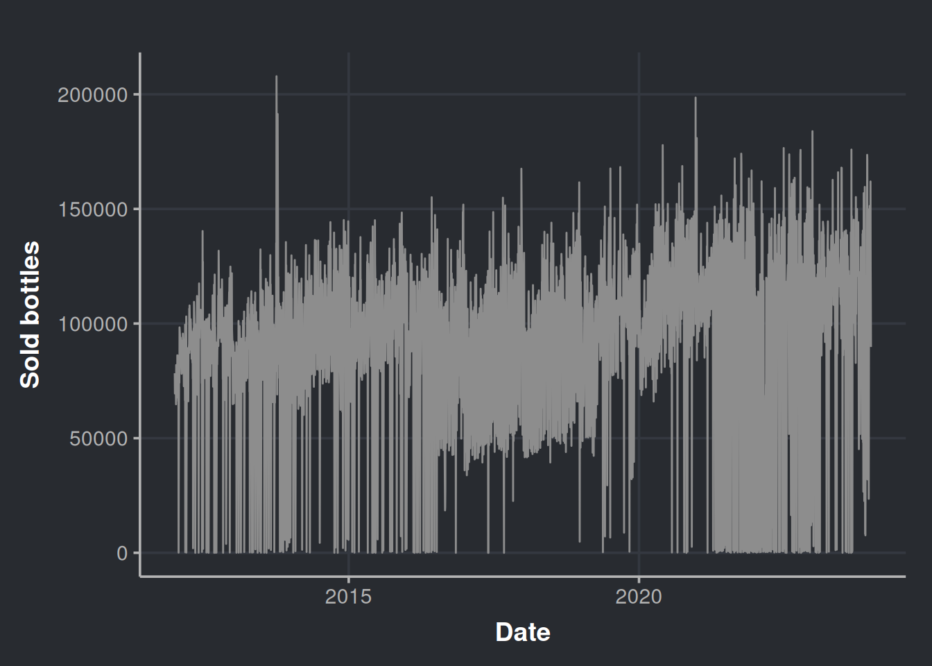
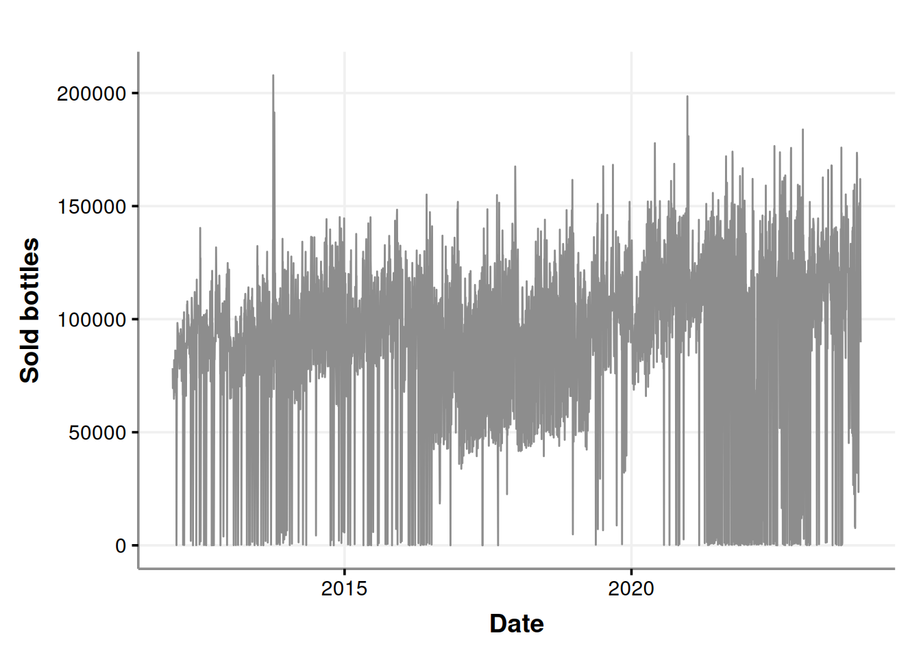
It seems that there are a lot of purchases near to zero. Could all the liquor stores agree to not purchase in certain days? Let’s re-check considering the week days in the chart.
consumption_time_series_day_plot <-
  ggplot(consumption_day_summary, aes(x = as.Date(day), y = n_bottles)) +
  geom_line(color = "#8d8d8d") +
  geom_point(aes(color = as.factor(week_day))) +
  labs(x = 'Date', y = 'Sold bottles', color = "Day of the week")

consumption_time_series_day_plot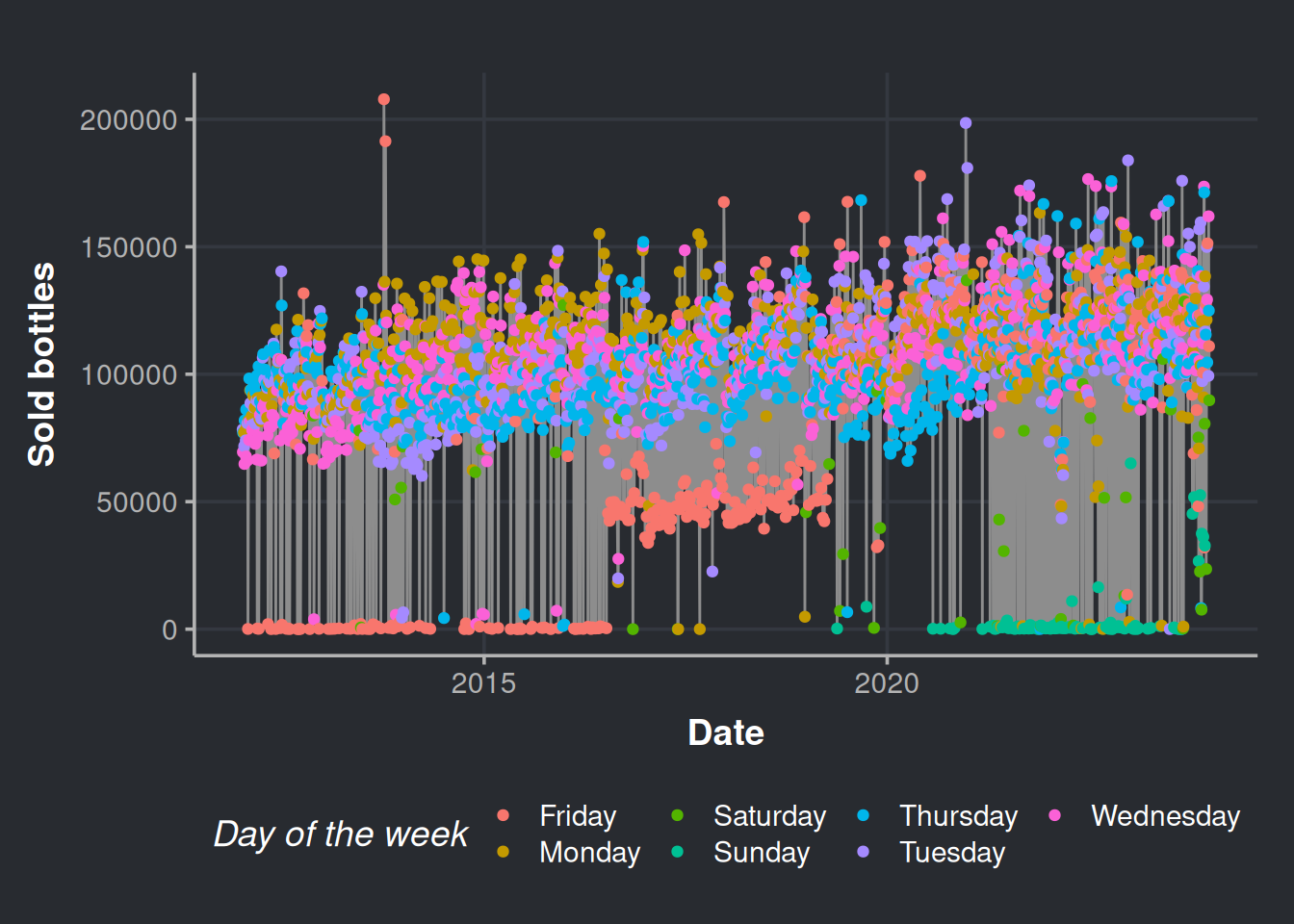
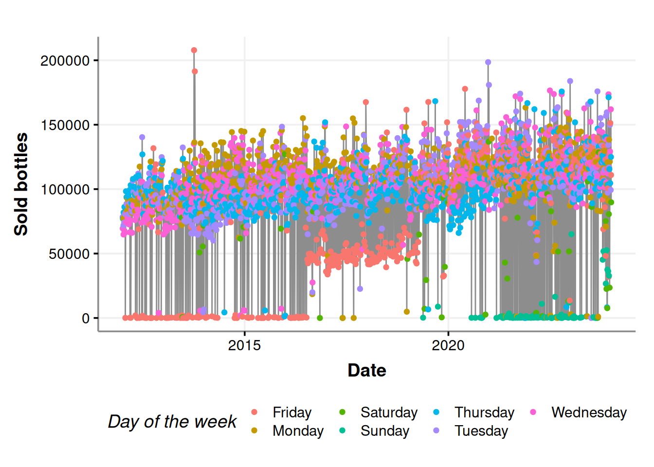
Fridays, Saturdays, and Sundays are the days with fewer purchases. Indeed, the stores do not put orders on weekends (most of the times).
Now, let’s explore the calendar effect in our time series data. Here, we will gain a general notion of how the human cycles surrounding the calendar (such as weekends and holidays) affect liquor sales. This will be very easy with the library timetk by Matt Dancho. The function plot_seasonal_diagnostics, creates the relevant plots for this analysis. Please interact with the charts below by hovering over the different elements.
consumption_day_summary %>%
  mutate(day_=ymd(day)) %>%
  as_tsibble(index=day_) %>%
  fill_gaps(n_bottles = 0)  %>% # Fill with zeroes the days that do not have receipts
  as_tibble() %>%
  timetk::plot_seasonal_diagnostics(day_, n_bottles)
Initially, we can observe that the stores tend to avoid making purchases on weekends. Moving on to the month-wise analysis, we can see that October and December have the highest number of assets compared to other months, which is consistent with the trend observed in the last quarter of the year. Finally, looking at the year-wise data, it appears that 2013 and 2020 were favorable years for selling alcoholic drinks.
Anomaly detection in time series
We can look for anomalies in our time series structure as part of our EDA process. For this, we will use an unsupervised anomaly detection algorithm: the isolation forest algorithm, also known as the iForest. This method proposes that the “weirder” values are, the easier to separate. So the fewer steps it takes to separate a point from the rest, the more memorable it will be (i.e., an anomaly). The iForest algo is a good choice since it is fast to run, and we have easy-to-use implementations at hand. Here, we will be just algorithm users, but if you want to gain a deeper understanding of this, go for Jason Brownlee’s1 tutorial.
Let’s prepare our data for the iForest run. We will pull this data directly from our python session
data_iforest <- consumption_day_summary %>%
  select(day, n_bottles, week_day, weekend) %>%  # Relevant features
  mutate(month = month(day, abbr = FALSE, label=TRUE)) # the month will also be a feature
Please note that the code below is written in Python. We can leverage the cool stuff in the Python community by utilizing the reticulate R library. Then, in our Python environment, we can use the PyCaret library, which is an amazing library for running complex machine learning workflows with minimal code. This saves us a lot of time, so we can focus on what is happening with the liquor sales. The code shown below has been modified from Moez Ali’s tutorial.
# Data load. We pull it from our R environment
time_series_data = r.data_iforest

# Data prep. Set the date as the DataFrame index, then, drop the column day
time_series_data.set_index('day', drop=True, inplace=True)


# PyCaret setup
from pycaret.anomaly import *
s = setup(time_series_data, session_id = 11)
# Train model
iforest = create_model('iforest', fraction = 0.1)iforest_results = assign_model(iforest)Please notice above that we extract the data we prepared in R, data_iforest, with the Python global variable r. The converse also happens in the R environment, and we use the reticulate global variable, py, to bring the PyCaret results into R.
iforest_results <- py$iforest_results %>%
  mutate(Anomaly = as.factor(Anomaly)) # We will use the anomaly as a factor

# We cannot plot the date as a df index
iforest_results$day <- as.Date(rownames(iforest_results), format = "%Y-%m-%d")
Let’s see the results!
anomalies_plot <- ggplot(iforest_results, aes(x=day, y=n_bottles)) +
  geom_line(color="#8d8d8d") +
  geom_point(aes(color=Anomaly)) +
  scale_color_manual(values=c("#58bbc3", "#e78170")) +
  labs(x='Date', y = 'Sold bottles', color="Anomaly") +
  scale_x_date(date_breaks = "2 year",date_labels = "%Y")

anomalies_plot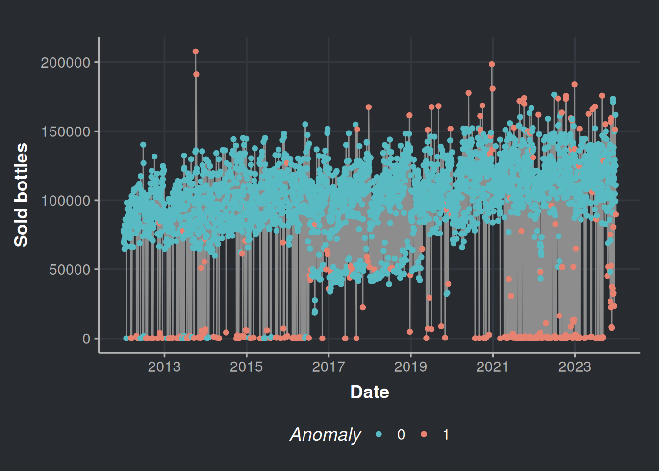
It seems that most of the anomalies are those near zero on weekends (Friday, Saturday, and Sunday); this is because more businesses are closed on weekends; there are no purchases there, all good. We can contrast the above figure with the following chart.
consumption_time_series_is_weekend_plot <-
  ggplot(consumption_day_summary, aes(x = as.Date(day), y = n_bottles)) +
  geom_line(color = "#8d8d8d") +
  geom_point(aes(color = as.factor(weekend))) +
  scale_color_manual(values=c("#58bbc3", "#e78170")) +
  labs(x = 'Date', y = 'Sold bottles', color = "Is weekend?") +
  scale_x_date(date_breaks = "2 year",date_labels = "%Y")

consumption_time_series_is_weekend_plot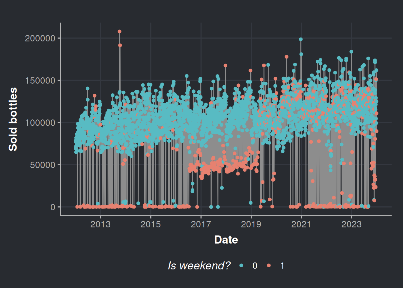
Most of the lower anomalies are due to weekends.
But wait a second, what are those in the 4th and the 11th of October 2013? Those look suspicious. In fact, let’s check all the anomalies above the percentile 50%. We are not interested in the lower anomalies because we know that most establishments do not place orders on weekends.
# Prepare a vector with the percentiles
percentiles <- seq(from = 0, to = 1, by = 0.05)
percentile_bottles <- quantile(iforest_results$n_bottles, percentiles)

# We filter all the anomalies above the percentile 50%
anomalies_over_p50_bottles <- iforest_results %>%
  filter(n_bottles > percentile_bottles['50%'],
         Anomaly == 1) %>%
  # Added some extra variables
  mutate(month_number     = month(day),
         month_day_number = mday(day) + rnorm(n(), sd=0.3), # Added some Gaussian noise to the day number to appreciate in the plot the holidays that overlap every year
         year_day_number  = yday(day))

# Get some holidays
daynumber_by_month_holidays <- holidays %>%
  filter(Type %in% c('Holiday', 'TV')) %>%
  mutate(month_number = month(date),
         month_day_number   = mday(date)) %>%
  group_by(Event) %>%
  summarise(mean_month = mean(month_number),     # Month will always be the same, mean function is to have a result in the aggregated summary
            mean_day   = mean(month_day_number)) # The day vary every year for certain holidays, hence we want an average coordinate for the day axis
With the above data, we will plot the top outliers alongside the booziest days in the United States, based on information from alcohol.com.
daynumber_by_month <- ggplot(anomalies_over_p50_bottles, aes(x=month_day_number, y=month_number)) +
  geom_point(color="#8d8d8d") +
  geom_point(data=daynumber_by_month_holidays, aes(x=mean_day, y=mean_month), size=7, color='#58bbc3', alpha=0.5) +
  geom_text(data = daynumber_by_month_holidays, nudge_x = 0.25, nudge_y = 0.25,
            check_overlap = T, aes(label=Event, x=mean_day, y=mean_month), color="#8d8d8d") +
  labs(x='Month day number', y = 'Month number')

daynumber_by_month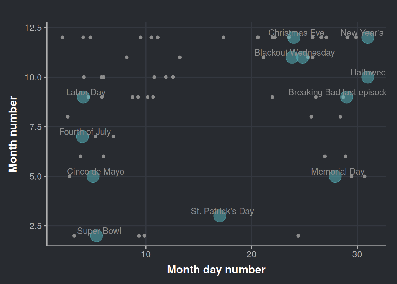
It’s interesting to note that while some outliers cluster around certain holidays, none are from St. Patrick’s Day even though outliers exist for other holidays like Cinco de Mayo.
We can also check how these anomalies (the ones above quantile 50%) distribute across the year.
ggplot(anomalies_over_p50_bottles, aes(x = year_day_number)) +
  geom_density(color = "darkblue", fill = "lightblue", alpha = 0.7) +
labs(x='Year day number', y = 'Density') 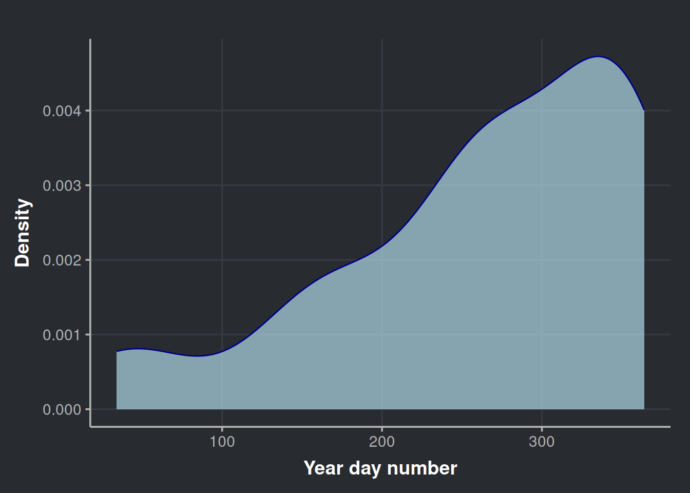
It is clear the heaviest drinking days of the year are concentrated at the end of the year.
Exploring time series composition
To extract more insights from our time series data, it’s useful to break it down into its three main components: trend, season, and the remainder. To do this, we’ll use the STL decomposition method, which stands for Seasonal and Trend decomposition using Loess.
STL is a great choice as it can detect various types of seasonality and can be tailored to specific needs. Moreover, it’s a reliable method that generally delivers accurate results. You can find more information about STL in the book “Forecasting: Principles and Practice” by Hyndman and Athanasopoulos (2021).
consumption_day_summary %>%
  select(day, n_bottles) %>%
  mutate(day = ymd(day)) %>%
  as_tsibble(index = day) %>%
  fill_gaps(n_bottles = 0) %>% # We will assume that for the days with no data are because not purchases occurred, which have sense since most of them are on weekends (i.e. lot of people don't work)
  model(stl = STL(n_bottles)) %>%
  components() %>%
autoplot(color = '#8d8d8d') 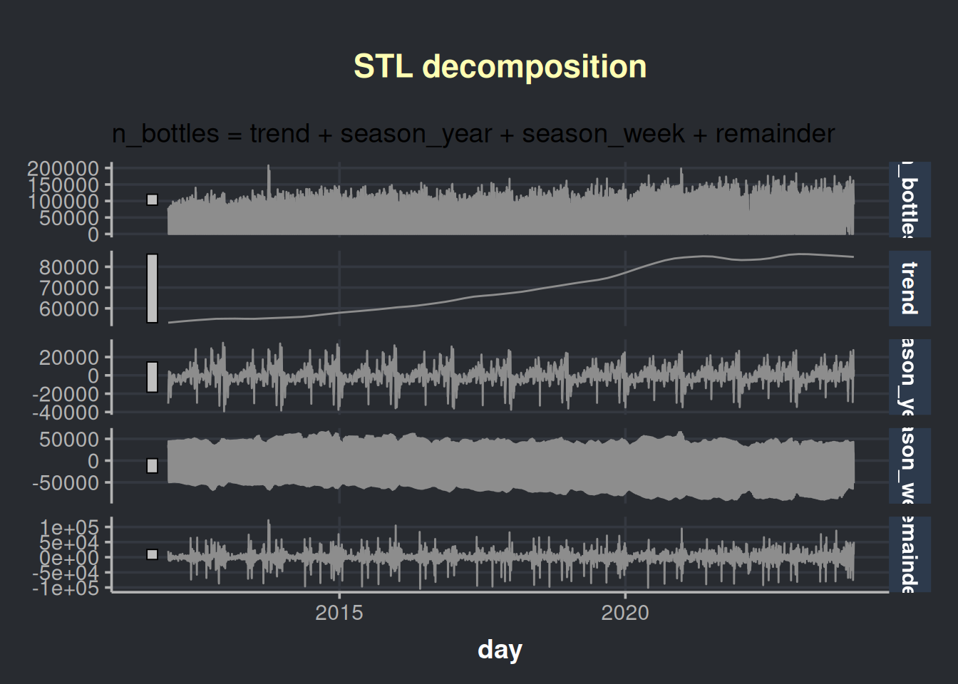
We are presented with four charts in this visualization; the first one is our time series, which is followed by its components:
- The trend in liquor sales over time
- The seasonal pattern throughout the years
- The seasonal pattern throughout the weeks
- The remainder, which is the variability that cannot be explained. Also known as noise.
The above chart has a lot of information. Let’s aggregate the info in months to analyze the chart with less granularity.
consumption_month_decomposition <- consumption_day_summary %>%
  select(day, n_bottles) %>%
  group_by(month=yearmonth(day)) %>%
  summarise(n_bottles=sum(n_bottles)) %>%
  as_tsibble(index=month) %>%
  model(stl = STL(n_bottles)) %>%
  components()
Now we plot at a month granularity.
consumption_month_decomposition %>%
  autoplot(color = '#8d8d8d') %>%
  ggplotly()
This chart is interactive. Please hover over the parts that catches your attention. The seasonal behavior of alcohol consumption is interesting throughout the year (season_year tile). We notice three peaks in the year seasonality, the first one being in June (which is relatively modest), the second in October, and the third in December. Also, we observe an increasing trend in the acquisition of alcohol by stores, which could be due to an increase in the population, as indicated by the following chart. Data obtained from datacommons.org.
# Estimated population of Iowa since 2012
ggplot(iowa_population, aes(x=Year, y=Population/1e6)) +
  geom_point(color = '#8d8d8d') +
  geom_smooth(method = lm, formula = y ~ x, se = FALSE, color = '#696969') +
  labs(x = "Year", y = "Population in Millions")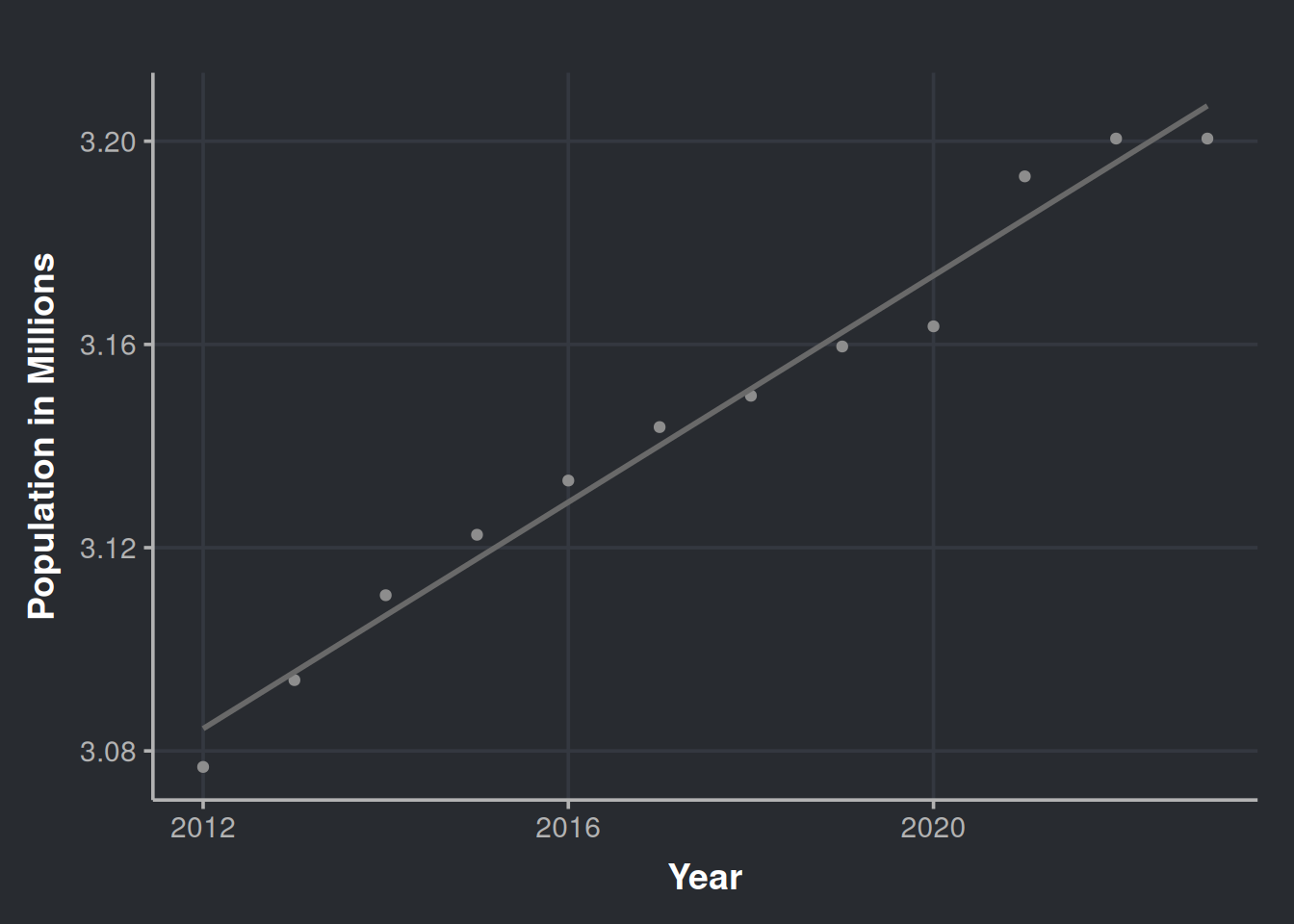
Over the past 12 years, the population has increased. However, could offering a wider variety of products increase liquor sales? Would appeal to diverse tastes impact the amount of alcohol sold?
Shall we examine how the variety of alcoholic beverages has expanded throughout the years?
iowa_liquor_data %>%
  select(date, itemno) %>%
  group_by(month = yearmonth(date)) %>%
  summarise(n_different_products=n_distinct(itemno)) %>%
  as_tsibble(index = month) %>%
  model(stl = STL(n_different_products)) %>%
  components() %>%
  autoplot(color = '#8d8d8d') %>%
  ggplotly()
Ulalà… look at this beauty! It seems like every year more and more products are being introduced to the market. Another interesting observation is that there is always a rise in the variety of available products during October, please hover over the season_year row. Is this because of the upcoming year-end celebrations or the introduction of autumn flavors such as pumpkin spice? Could it be that stores are promoting new products to potential customers as a way to encourage sales towards the end of the year?
Yes, the variety of alcoholic beverages available in the market has increased over time, which means that there are more options to cater to different tastes. For example, some people may not like raspberry vodka but might prefer tamarind Smirnoff, or they could enjoy the one that comes in a bottle with a skull design. Having more options ensures that everyone can find a drink that they like.

Determining the effect of diversity in inventory over sales
We noticed a sales increase in bottles over time. Is the rise merely due to population growth, or does the market offer play a role? Let’s find out!
Our next step is to investigate whether the number of diverse products in the market is a reliable indicator of sales. It’s important to note that diversity encompasses not only different flavors, but also various sizes and presentations. For instance, a smaller bottle of the same rum, or a special edition of your favorite tequila brand with collectible shot glasses.
Now that we know that the population of Iowa has been increasing and that it could be a potential confounder when we try to estimate the effect of the diversity of products, we should consider it. To begin with, we must adjust the sales figures based on the population data (i.e., normalize by the current population in a given time).
# Data set to test our hypothesis of inventory diversity and more sales
sale_by_diversity <- iowa_liquor_data %>%
  select(date, itemno, sale_bottles) %>%
  group_by(month = yearmonth(date)) %>%   # We will explore monthly data in our (available) history
  mutate(year = year(month)) %>%
  left_join(iowa_population, by = c("year"="Year")) %>% # Integrate with Iowa population data
  mutate(population_millions = Population/1e6,          # A variable for the population in Millions
         bottles_per_million_inhabitants = sale_bottles/population_millions,
         bottles_per_capita = sale_bottles/Population) %>% # Sales of bottles per million inhabitants
  summarise(n_different_products     = n_distinct(itemno),
            bottles_sale_per_million = sum(bottles_per_million_inhabitants),
            bottles_sale_per_capita  = sum(bottles_per_capita))
Pro-tip: avoid using sale_dollars as inflation could act as a confounder. To include dollars, we should adjust for inflation and remove its effect. We won’t do that here.
Let’s visualize the data.
ggplot(sale_by_diversity, aes(x = n_different_products, y = bottles_sale_per_million)) +
  geom_point(color = '#8d8d8d') +
  geom_smooth(method = lm, formula = y ~ x, se = FALSE, color = '#696969') +
  labs(x = "Different products available", y = "Bottles sold per million inhabitants")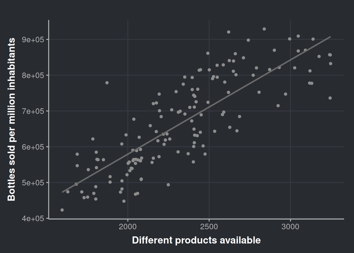

Very nice! It seems that the diversity of products is a good predictor. We can get more numerical info from this if we run a linear model. We will regress bottle sales on the number of different products, so, in other words, we will try to predict the number of bottles sold by using the diversity in our inventory.
# Linear model
fit_sales_by_diversity <- lm(bottles_sale_per_million ~ n_different_products,
                             data = sale_by_diversity)

summary(fit_sales_by_diversity)
Call:
lm(formula = bottles_sale_per_million ~ n_different_products,
    data = sale_by_diversity)

Residuals:
    Min      1Q  Median      3Q     Max
-170778  -53026   -7017   53373  233399

Coefficients:
                     Estimate Std. Error t value Pr(>|t|)
(Intercept)          52334.19   36561.44   1.431    0.155
n_different_products   263.45      15.38  17.126   <2e-16 ***
---
Signif. codes:  0 '***' 0.001 '**' 0.01 '*' 0.05 '.' 0.1 ' ' 1

Residual standard error: 74600 on 142 degrees of freedom
Multiple R-squared:  0.6738,    Adjusted R-squared:  0.6715
F-statistic: 293.3 on 1 and 142 DF,  p-value: < 2.2e-16
There are a lot of good tutorials and textbooks that dig deeper into the validation of linear models, so we will skip that part and use gvlma to check the assumptions in a time-saving manner.
gv_sales_by_diversity <- gvlma::gvlma(fit_sales_by_diversity)
summary(gv_sales_by_diversity)
Call:
lm(formula = bottles_sale_per_million ~ n_different_products,
    data = sale_by_diversity)

Residuals:
    Min      1Q  Median      3Q     Max
-170778  -53026   -7017   53373  233399

Coefficients:
                     Estimate Std. Error t value Pr(>|t|)
(Intercept)          52334.19   36561.44   1.431    0.155
n_different_products   263.45      15.38  17.126   <2e-16 ***
---
Signif. codes:  0 '***' 0.001 '**' 0.01 '*' 0.05 '.' 0.1 ' ' 1

Residual standard error: 74600 on 142 degrees of freedom
Multiple R-squared:  0.6738,    Adjusted R-squared:  0.6715
F-statistic: 293.3 on 1 and 142 DF,  p-value: < 2.2e-16


ASSESSMENT OF THE LINEAR MODEL ASSUMPTIONS
USING THE GLOBAL TEST ON 4 DEGREES-OF-FREEDOM:
Level of Significance =  0.05

Call:
 gvlma::gvlma(x = fit_sales_by_diversity)

                    Value p-value                   Decision
Global Stat        9.1377 0.05775    Assumptions acceptable.
Skewness           1.6717 0.19603    Assumptions acceptable.
Kurtosis           0.5956 0.44027    Assumptions acceptable.
Link Function      6.1291 0.01330 Assumptions NOT satisfied!
Heteroscedasticity 0.7413 0.38923    Assumptions acceptable.
The model only failed to meet the Link Function assumption, which indicates that we have either wrongly specified the link function or missed an important predictor in our model. You can refer to Peña and Slate (2006) for more information. However, since the model satisfies the Skewness, Kurtosis, and Heteroscedasticity assumptions, we will temporarily ignore the link function issue, and address this later.
Let’s make sense of our model.
fit_sales_by_diversity_summary <- summary(fit_sales_by_diversity)
fit_sales_by_diversity_summary
Call:
lm(formula = bottles_sale_per_million ~ n_different_products,
    data = sale_by_diversity)

Residuals:
    Min      1Q  Median      3Q     Max
-170778  -53026   -7017   53373  233399

Coefficients:
                     Estimate Std. Error t value Pr(>|t|)
(Intercept)          52334.19   36561.44   1.431    0.155
n_different_products   263.45      15.38  17.126   <2e-16 ***
---
Signif. codes:  0 '***' 0.001 '**' 0.01 '*' 0.05 '.' 0.1 ' ' 1

Residual standard error: 74600 on 142 degrees of freedom
Multiple R-squared:  0.6738,    Adjusted R-squared:  0.6715
F-statistic: 293.3 on 1 and 142 DF,  p-value: < 2.2e-16
First, we can observe in the R2 that the model can explain 67% of our data variability, i.e., the diversity in alcoholic products is a good predictor over all liquor sale in Iowa. Second, we can observe that the estimate for the variable n_different_products is 263. We interpret this as follows: with the release of each new product in the market, the monthly (alcohol) sales will increase in 263 bottles, per million of inhabitants, in the State of Iowa.
But how to present this information to non-technical people?
Imagine that you work for a liquor distributor and are presenting your findings to the top executives. Firstly, the phrase “will increase in 263 bottles per million inhabitants” is fairly complex. Therefore, and assuming you are in the year 2027 and you know that the population is approximately 3.8 million, you could say something simpler, such as:
“For every new product, or new presentation of our old product, we launch in Iowa, we will sell around 1000 (i.e.,
263.45×3.8) extra units monthly”
Notice that we say “around 1000” to facilitate the digestion of the info. Round numbers decrease the cognitive load, are easy to remember, and will be easier to assimilate them by your audience. Of course it is not that simple, if the product is well liked by the population it will sell even more, but if it sucks it wont sell. Also, having more products in the inventory could increase costs in logistics, marketing, and so on.
For a different scenario, now you are a consultant working for a local health organization that is trying to combat the negative effects of excessive alcohol consumption. You have been tasked with presenting the results of your research to government and health entities. Your presentation should include the outcomes of your investigation, such as:
“The growing variety of alcohol products in the market is making it more attractive to consumers. To address this, we suggest imposing an additional tax on sellers who have more than X number of different alcoholic products in their inventory. The revenue generated from this tax can be allocated towards funding rehabilitation clinics and other programs aimed at helping those struggling with alcohol addiction.”
Remember that link function assumption violation?
Let’s go back to the part in which our model didn’t fulfill all the requirements for good inference. So, we didn’t accomplish all the assumptions proposed by Peña and Slate (2006); their approach is quite attractive since the proposed framework includes a global metric and considers the interplay of assumptions
We will run almost the same model, just with a little difference. Our variables will be log-transformed.
ggplot(sale_by_diversity, aes(x=log(n_different_products), y=log(bottles_sale_per_million))) +
  geom_point(color = '#8d8d8d') +
  geom_smooth(method = lm, formula = y ~ x, se = FALSE, color = '#696969') +
labs(x = "Log(Number of different products)", y = "Log(Bottles sold per million inhabitants)")![]()
![]()
The plot does not seem that different. Now we proceed with the model.
# Linear model, log transformed variables
fit_sales_by_diversity_log <- lm(log(bottles_sale_per_million) ~ log(n_different_products), data=sale_by_diversity)
# Check assumptions
gv_sales_by_diversity_log <- gvlma::gvlma(fit_sales_by_diversity_log)
summary(gv_sales_by_diversity_log)
Call:
lm(formula = log(bottles_sale_per_million) ~ log(n_different_products),
    data = sale_by_diversity)

Residuals:
     Min       1Q   Median       3Q      Max
-0.26032 -0.08039 -0.00294  0.08170  0.37017

Coefficients:
                          Estimate Std. Error t value Pr(>|t|)
(Intercept)                6.01874    0.42124   14.29   <2e-16 ***
log(n_different_products)  0.95248    0.05438   17.52   <2e-16 ***
---
Signif. codes:  0 '***' 0.001 '**' 0.01 '*' 0.05 '.' 0.1 ' ' 1

Residual standard error: 0.1117 on 142 degrees of freedom
Multiple R-squared:  0.6836,    Adjusted R-squared:  0.6813
F-statistic: 306.8 on 1 and 142 DF,  p-value: < 2.2e-16


ASSESSMENT OF THE LINEAR MODEL ASSUMPTIONS
USING THE GLOBAL TEST ON 4 DEGREES-OF-FREEDOM:
Level of Significance =  0.05

Call:
 gvlma::gvlma(x = fit_sales_by_diversity_log)

                    Value p-value                Decision
Global Stat        3.8134  0.4318 Assumptions acceptable.
Skewness           0.2874  0.5919 Assumptions acceptable.
Kurtosis           0.2215  0.6379 Assumptions acceptable.
Link Function      1.5119  0.2189 Assumptions acceptable.
Heteroscedasticity 1.7927  0.1806 Assumptions acceptable.
Great! Now we fulfill the global stat, so we can say that the inference derived from this model will be more robust. Continuing with the model…
fit_sales_by_diversity_log_summary <- summary(fit_sales_by_diversity_log)
fit_sales_by_diversity_log_summary
Call:
lm(formula = log(bottles_sale_per_million) ~ log(n_different_products),
    data = sale_by_diversity)

Residuals:
     Min       1Q   Median       3Q      Max
-0.26032 -0.08039 -0.00294  0.08170  0.37017

Coefficients:
                          Estimate Std. Error t value Pr(>|t|)
(Intercept)                6.01874    0.42124   14.29   <2e-16 ***
log(n_different_products)  0.95248    0.05438   17.52   <2e-16 ***
---
Signif. codes:  0 '***' 0.001 '**' 0.01 '*' 0.05 '.' 0.1 ' ' 1

Residual standard error: 0.1117 on 142 degrees of freedom
Multiple R-squared:  0.6836,    Adjusted R-squared:  0.6813
F-statistic: 306.8 on 1 and 142 DF,  p-value: < 2.2e-16
The model still explains around 68% of the variability in the data, but with different coefficients. Log-Log regression (log dependent variable, log predictor) has an intuitive interpretation. For every 1% increase in X, there will be a β% increase (or decrease if β is negative) in the dependent variable (Y). In this scenario, β is estimated to be 0.95, this means that a 1% increase in the diversity of products sold in the state of Iowa, will result in a 95% increase in bottle sales. In other words, every time the inventory diversifies by 1%, the number of bottles sold will (almost) double. However, it’s crucial to also consider the cost of logistics, available space on shelves and cellars, and the supply chain.
Wrapping up our inventory diversity findings
Our results are truly promising, and now is the perfect time to consider a strategic move. Before rushing to present this to decision-makers and ask for a major investment in new products, let’s pause for a moment. First, we must acknowledge the complexity of the real world and the possibility that we haven’t considered all relevant factors. Second, the extra costs of this move must measured.
Now that we have good evidence at hand, it’s time to propose a more measured approach. Imagine you’re working for a major retail corporation; you can suggest a pilot program with increased product diversity, perhaps a gourmet drinks aisle in randomly selected stores? This targeted strategy allows us to maintain better control over sales and expenses. It will give us a higher-resolution answer, guiding us to see if the investment is worth it.
If your experiment is approved, and at the same time, you are a curious person, prepare to delight! During the investigation, more questions will arise, and I recommend you write them down as soon they appear:
- Which of the new products are the most liked?
- Does the store’s location affect the sales of the more popular items?
- And so on.
After you finish the experiment and present your final results and strategies, take that list, prioritize, and work on your next project. For the prioritizing, I recommend you put the most interesting ones at the top of the list; after all, we’re here for fun. If that doesn’t get your ideas approved, prioritize the ones with higher revenue-generating potential, that should do the trick.
Now, let’s move to a question that started this data science project.
Did the COVID-19 pandemic increase the alcohol consumption of the population?
There is a great Wikipedia page that summarizes the history line of COVID-19 in Iowa. This is a great resource! We can integrate more valuable information into our analysis from there. This info will be in the iowa_first_covid_events data set.
We will modify our data set to consider the inventory diversity effect and control for this confounder. First, let’s get a vector with all the items available before the pandemic start.
pandemic_start_date <- min(iowa_first_covid_events$Date)

items_prepandemic <- iowa_liquor_data %>%
  filter(date < pandemic_start_date) %>%
  dplyr::pull(itemno) %>%
  unique()
Then, let’s filter our data to exclude the receipts that include any during-, and post-pandemic item; after that, we can do a monthly aggregation of our time series.
sales_in_covid_times <- iowa_liquor_data %>%
  select(date, itemno, sale_bottles) %>%
  filter(itemno %in% items_prepandemic) %>% # Only consider items that were present before the pandemic to contro for confounding
  group_by(month = yearmonth(date)) %>%   # We will explore monthly data in our (available) history
  mutate(year = year(month)) %>%
  left_join(iowa_population, by = c("year"="Year")) %>% # Integrate with Iowa population data
  mutate(population_millions = Population/1e6,          # A variable for the population in Millions
         bottles_per_million_inhabitants = sale_bottles/population_millions, # Sales of bottles per million inhabitants
         bottles_per_capita = sale_bottles/Population) %>%  # Sales per capita can also be useful
  summarise(n_different_products     = n_distinct(itemno),
            bottles_sale_per_million = sum(bottles_per_million_inhabitants),
            bottles_sale_per_capita  = sum(bottles_per_capita)) %>%
  ungroup() %>%
  mutate(year = year(month))
To control for this confounding factor, we will keep the variable n_different_products constant by including only items that did exist before the pandemic started (i.e., 2020-03-08). By doing so, we can ensure that any observed changes in the outcome variable are due to the intervention being under study, and not the confounding variable. If you want to learn more about causal inference, I recommend checking out Molak (2023) for a practical introduction, and Pearl and Mackenzie (2018) for a theoretical grasp.
Let’s have a look at this data.
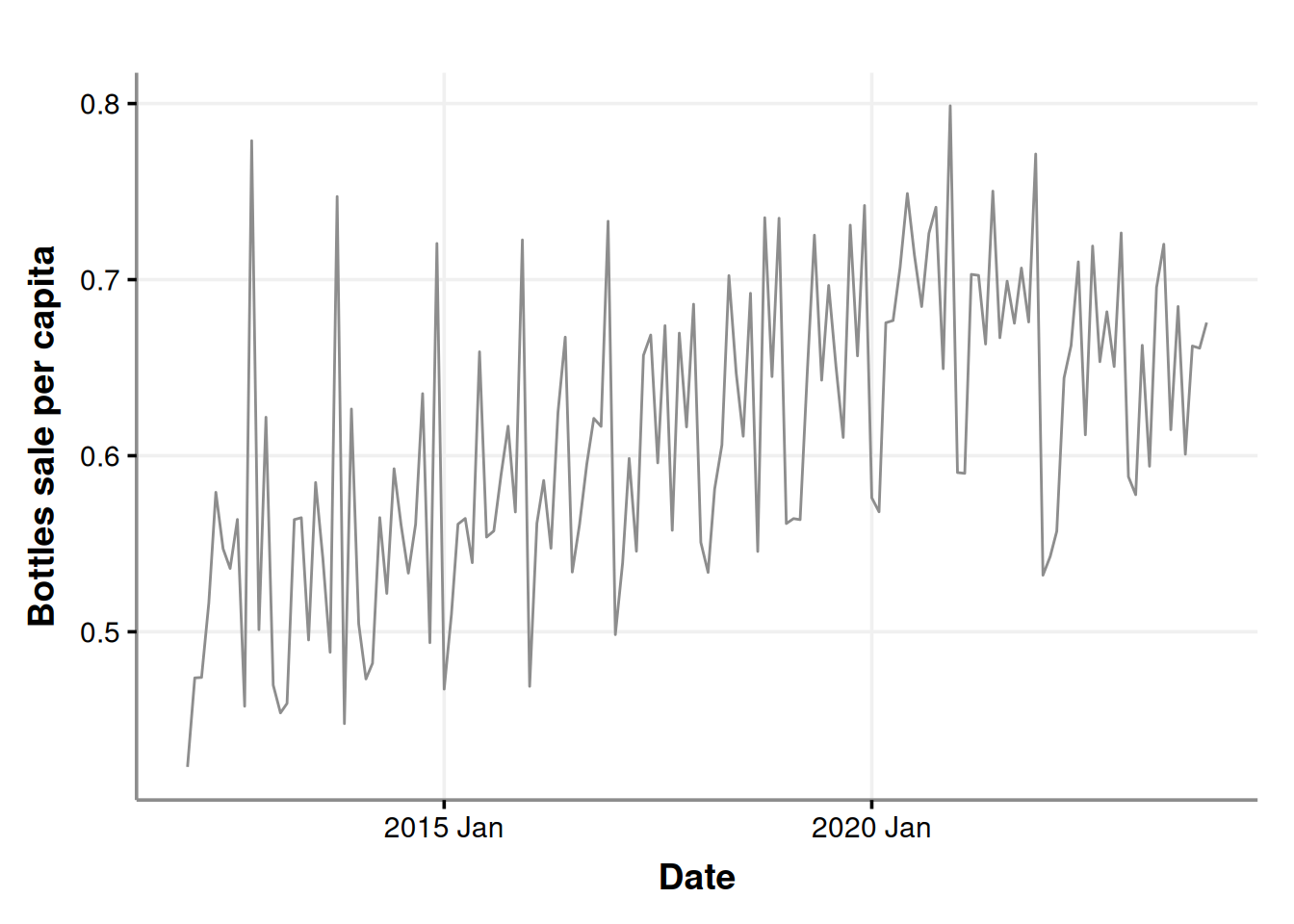
ggplot(sales_in_covid_times, aes(x=month, y=bottles_sale_per_capita)) +
  geom_line(color = '#8d8d8d') +
  labs(x = "Date", y = "Bottles sale per capita")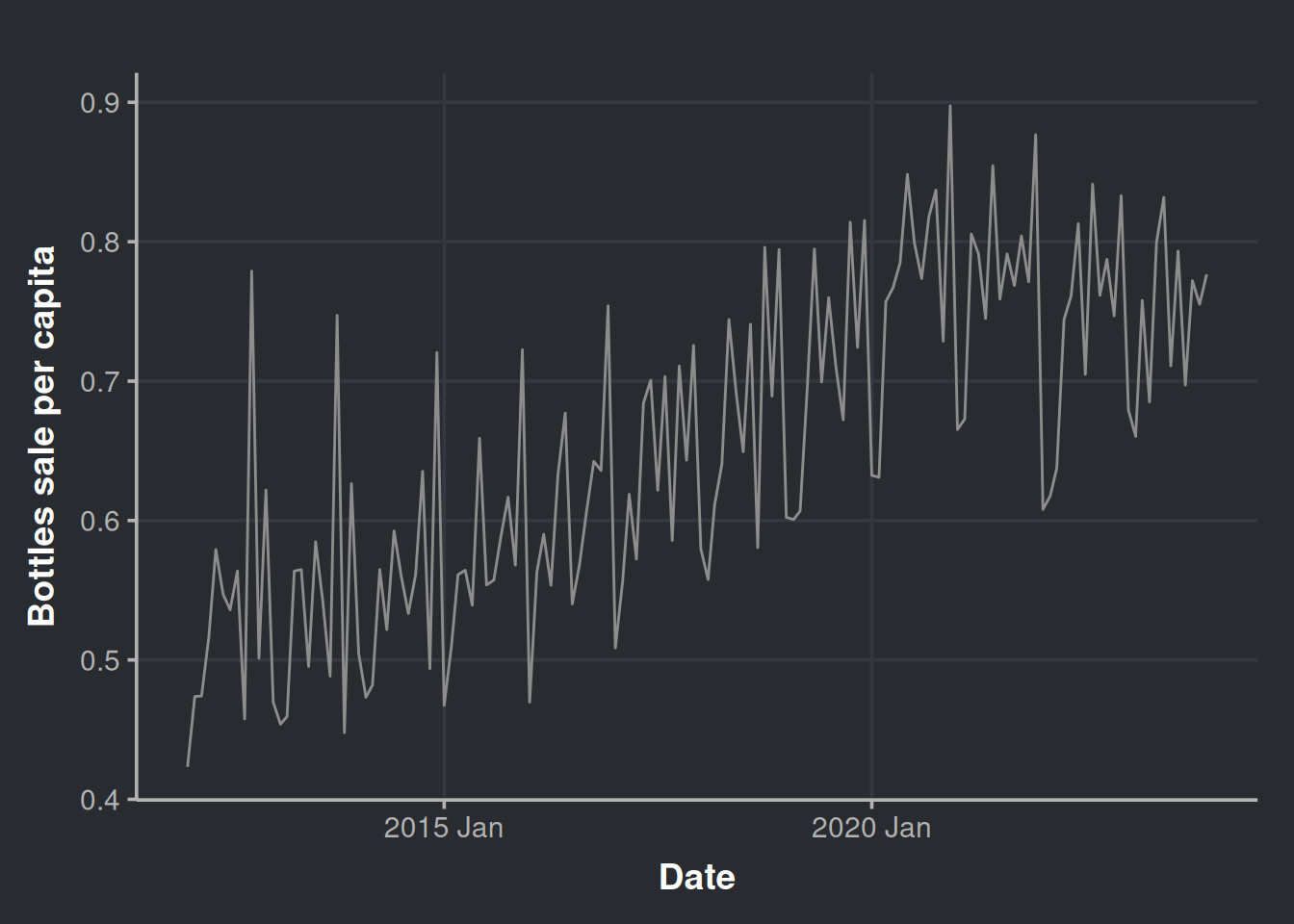
Let’s get a little more detailed with our chart and decompose it as we did before.
sales_in_covid_times %>%
  as_tsibble(index = month) %>%
  model(stl = STL(bottles_sale_per_capita)) %>%
  components() %>%
  autoplot(color = '#8d8d8d') %>%
  ggplotly()
When was the peak of sales after the adjustment?
month_with_more_sales <- sales_in_covid_times %>%
  filter(bottles_sale_per_million == max(bottles_sale_per_million))

paged_table(month_with_more_sales)
Now you must be thinking “Hey, as new products appear, also old ones disappear. The same year you restricted the emergence of new products, we observe a decrease in sales.”

And you’re right! Let’s put the restriction on new products much before the pandemic and then render a new trend chart. We create a vector with only the items available several years before the pandemic. Setting the new product filter in 2016 should be enough.
items_restriction_before_pandemic <- iowa_liquor_data %>%
  filter(date < as.Date("2016-01-01")) %>%  # We have chosen the start of 2016. More than four years apart from the pandemic
  dplyr::pull(itemno) %>%
  unique()
Generate time series data set
sales_precovid_times <- iowa_liquor_data %>%
  select(date, itemno, sale_bottles) %>%
  filter(itemno %in% items_restriction_before_pandemic) %>% # Only items that existed before year 2016
  group_by(month = yearmonth(date)) %>%
  mutate(year = year(month)) %>%
  left_join(iowa_population, by = c("year"="Year")) %>% # Integrate with Iowa population data
  mutate(population_millions = Population/1e6,          # A variable for the population in Millions
         bottles_per_million_inhabitants = sale_bottles/population_millions,
         bottles_per_capita = sale_bottles/Population) %>% # Sales of bottles per million inhabitants
  summarise(n_different_products     = n_distinct(itemno),
            bottles_sale_per_million = sum(bottles_per_million_inhabitants),
            bottles_sale_per_capita  = sum(bottles_per_capita))
Plot our time series to have a general sense of the change. The trend still seems to be there.
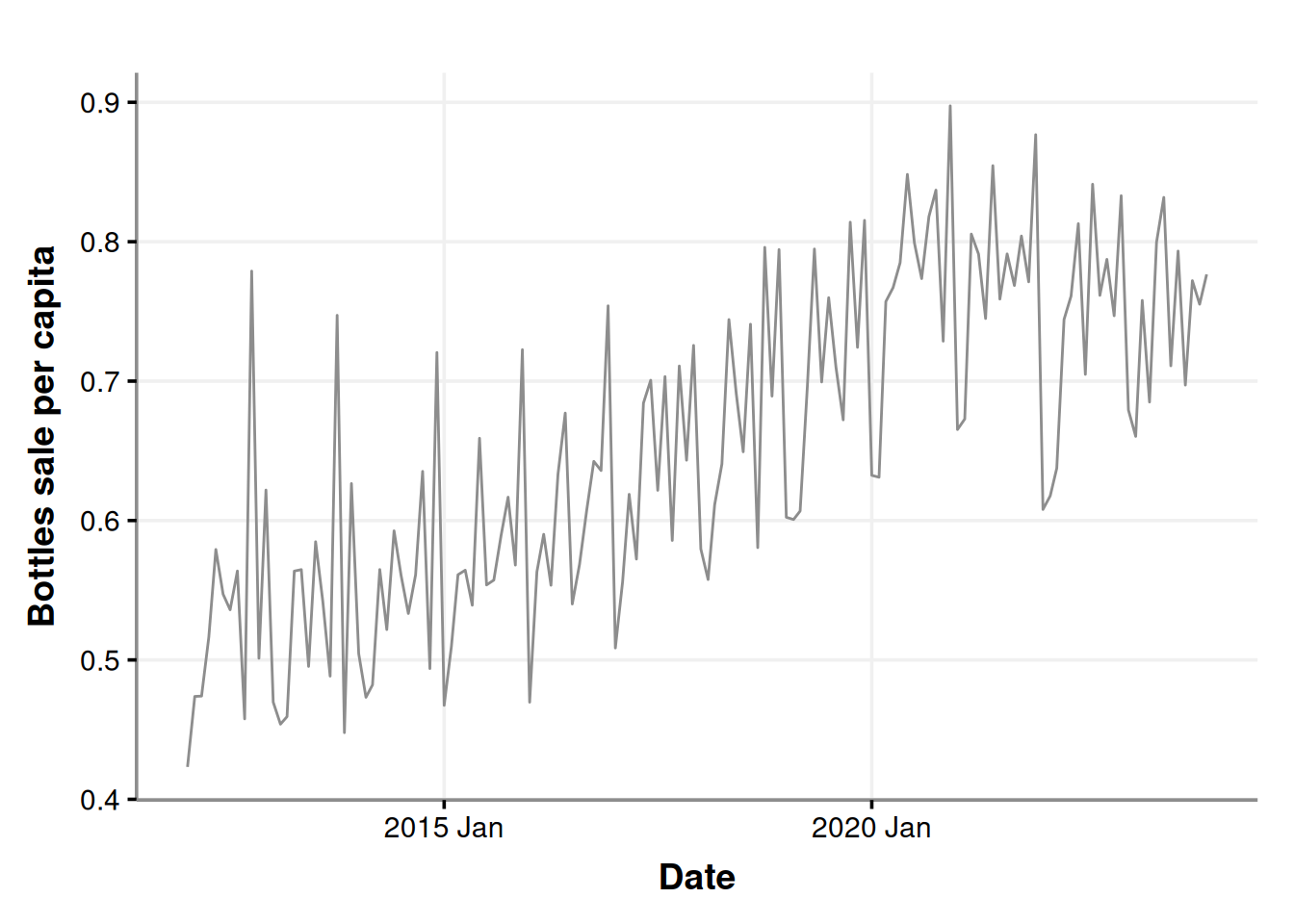
ggplot(sales_precovid_times, aes(x=month, y=bottles_sale_per_capita)) +
  geom_line(color = '#8d8d8d') +
  labs(x = "Date", y = "Bottles sale per capita")
Let’s get a little more detailed with our chart and decompose it.
sales_precovid_times %>%
  as_tsibble(index=month) %>%
  model(stl = STL(bottles_sale_per_million)) %>%
  components() %>%
  autoplot(color = '#8d8d8d') %>%
  ggplotly()
Please notice that the trend is almost the same.
Let’s see where is now the peak of alcohol purchases.
day_with_more_sales_2016_restriction <- sales_precovid_times %>%
  filter(bottles_sale_per_million == max(bottles_sale_per_million))

paged_table(day_with_more_sales_2016_restriction)
And there you have it! It is still Dec 2020. So we have more evidence to rule out the hypothesis of the decrease in sales due to the exclusion of new products while the old ones were drop into the oblivion. If a product is good and sells well, it should remain into the market
Now back to our sales_in_covid_times data set
We will conduct a formal test to assess whether there was an increase in alcohol sales during the pandemic, aiming to quantify the effect.
sales_in_covid_times <- sales_in_covid_times %>%
  mutate(year = as.factor(year(month)),          # we will add this variable to help us to distinguish between years
         month_number = as.factor(month(month)))
Filter only the start and the end of the emergency
covid_start_end_dates <- iowa_first_covid_events %>%
  filter(Date %in% c(min(iowa_first_covid_events$Date), max(iowa_first_covid_events$Date))) %>%
  mutate(event_summary=if_else(Date == min(Date), 'Start', 'End'))
In this table we can appreciate the pandemic started at the beginning of 2020, and it ended (by decree) at the start of 2023. If we visualize this we have:
sales_in_covid_times %>%
  as_tsibble(index = month) %>%
  model(stl = STL(bottles_sale_per_million)) %>%
  components() %>%
  autoplot(color = '#8d8d8d') +
  geom_vline(data = covid_start_end_dates, aes(xintercept = Date, color=event_summary)) +
  scale_color_manual(values = c("#4a6741", "#8a0303")) +
theme(legend.position = "bottom") 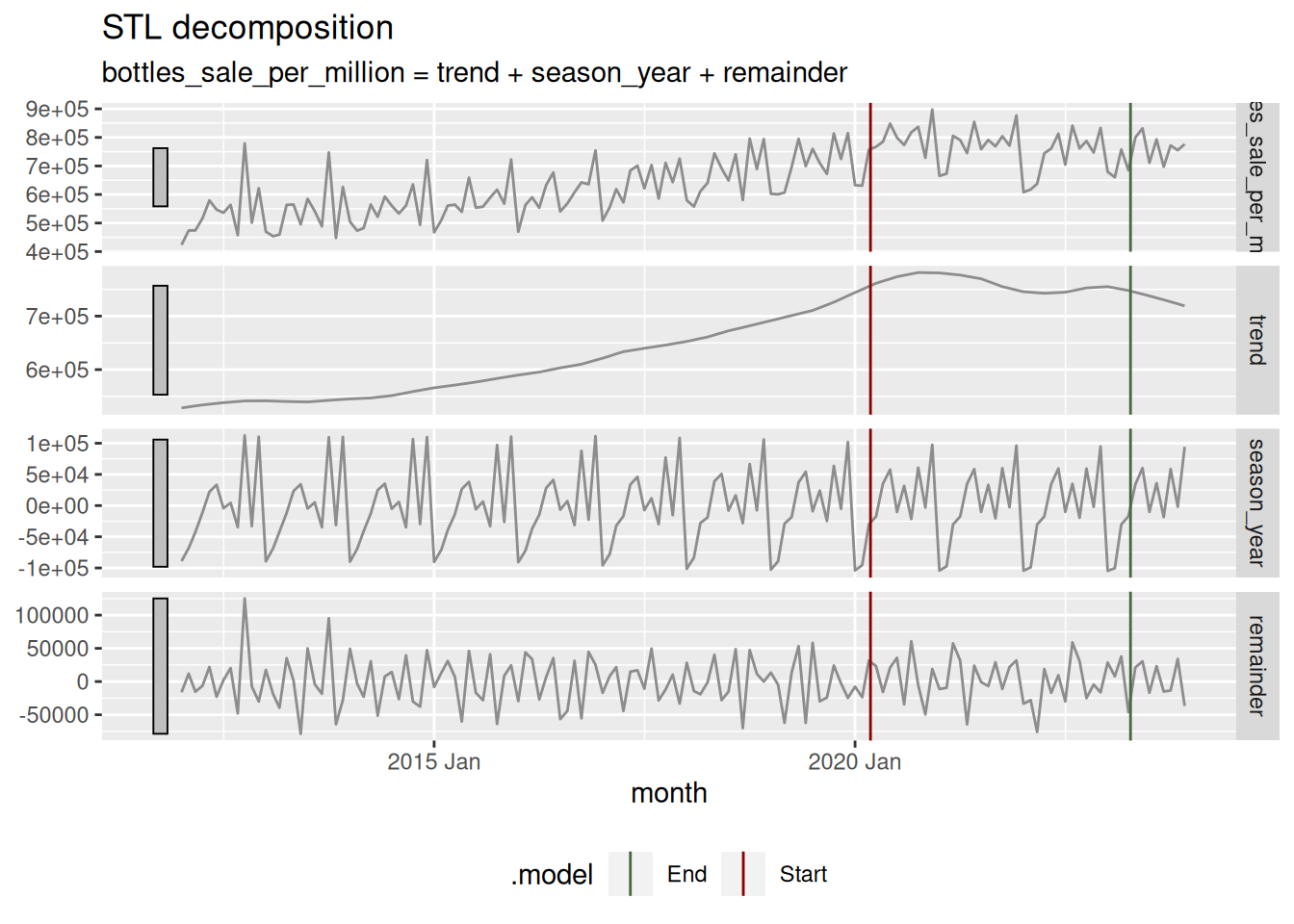
Remember that data set that considered the sales of only items that existed previous to the pandemic (sales_in_covid_times)? We will use it here to test in a formal manner if there was a difference in alcohol sales during the pandemic. First we will prepare each treatment data: pre-pandemic (2017, 2018, and 2019) and during-pandemic (2020, 2021, and 2022). Three years are selected.
pre_covid_data <- sales_in_covid_times %>%
  filter(year %in% c(2017, 2018, 2019)) # 36 months of aggregated data to compare

during_covid_data <- sales_in_covid_times %>%
  filter(year %in% c(2020, 2021, 2022)) # 36 months of aggregated data to compare
In order to investigate whether there was a change in alcohol sales as a result of the COVID-19 pandemic, we will be using a statistical technique developed by the psychologist John K. Kruschke (2013), who is known for the book of the puppies (Doing Bayesian Data Analysis). This technique is called “Bayesian Estimation Supersedes the t-Test,” BEST for short. The mean idea here is to apply inference to the problem of comparing means of two groups.
But why should we complicate ourselves with such esoteric approaches? (it is pretty popular, though..).
First, quantifying uncertainty is crucial when we conduct statistical inference. We want to be sure whether the observed effects are likely to be due to chance or if they represent actual differences due to an event, in this case, a pandemic. This way, we can measure the amount of “doubt” in our decisions.
Second, this approach is quite powerful since it allow us to speak in terms of the magnitude of the effect, which gives us an idea of how serious the situation is. It also has a beautiful interpretation that facilitates much of the communication of results to the stakeholders.
Third, the decision threshold for determining whether there is a difference between the treatment and control groups (such as during a pandemic vs. non-pandemic scenario) is straightforward to communicate and interpret. It’s also considered less arbitrary since it requires knowledge of the underlying phenomena.
For a comprehensive review on the subject, check Kruschke (2017). It is convenient for a data scientist to understand how this kind of techniques work, so it is worth taking a couple of hours of your time for this read.
Here, we will need to install the BEST library, but it was brought down from CRAN some time ago. No worries, you can install it with the following code.
# Please uncomment below lines if you want to install it
# install.packages('HDInterval') # Your system may complain during BEST install if you don't have this dependency
# install.packages('https://cran.r-project.org/src/contrib/Archive/BEST/BEST_0.5.4.tar.gz')
This method relies on MCMC to estimate the posterior distribution of the parameter we are interested in, the monthly mean sales of liquor bottles. So, the first step will be to run the MCMC to get the posterior distributions; we will do this with the function BESTout.
BESTout <- BESTmcmc(during_covid_data$bottles_sale_per_million,
                    pre_covid_data$bottles_sale_per_million,
                    parallel = FALSE)
We will do our inference with visual aid, but you can explore the object BESTout if you are curious, it contains lots of information. In the following chunk, we plot our posteriors. Kruschke’s library includes a lot of valuable functions. To get some useful charts, we will use plotPost.
# Some setup for the charts
mainColor = "skyblue"
dataColor = "red"
comparisonColor = "darkgreen"
ROPEColor = "darkred"
xlim <- range(BESTout$mu1, BESTout$mu2)

# First plot
par(mfrow=c(2,1)) # To set both estimated dsitributions in the same frame
plotPost(BESTout$mu1,
         xlim = xlim,
         cex.lab = 1.75,
         credMass = 0.95,
         showCurve = FALSE,
         xlab = bquote(mu[1]),
         main = paste("During Pandemic", "Mean "),
         mainColor = mainColor,
         comparisonColor = comparisonColor,
         ROPEColor = ROPEColor)

plotPost(BESTout$mu2,
         xlim = xlim,
         cex.lab = 1.75,
         credMass = 0.95,
         showCurve = FALSE,
         xlab = bquote(mu[2]),
         main = paste("Pre-pandemic", "Mean"),
         mainColor = mainColor,
         comparisonColor = comparisonColor,
         ROPEColor = ROPEColor)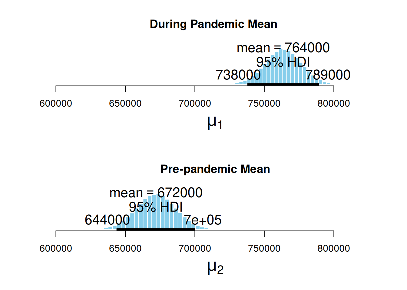
Here, we can appreciate the estimated posterior distribution for our parameters, the mean sales during the pandemic, and the mean sales in a pre-pandemic time. The black bars at the base of the distributions are the highest density intervals (HDI), also called the credible intervals, which are the distribution regions with the most credible values for the estimated measurement. First, we can notice that the estimated distribution for the pandemic parameter is further to the right. At the same time, the pre-pandemic parameter fell behind, hinting that the average sales during the pandemic were higher. Second, the HDIs do not overlap.
Now we visualize the magnitude of the effect. This is the difference between both distributions.
par(mfrow=c(1,1))
plotPost(BESTout$mu1 - BESTout$mu2,
         xlim = range(0, max(BESTout$mu1 - BESTout$mu2)),
         compVal = mean(pre_covid_data$bottles_sale_per_million) * 0.05, # Increase in at least 5%
         showCurve = FALSE,
         credMass = 0.95,
         xlab = bquote(mu[1] - mu[2]),
         cex.lab = 1.75,
         main = "Difference of Means",
         mainColor = mainColor,
         comparisonColor = comparisonColor,
         ROPEColor = ROPEColor)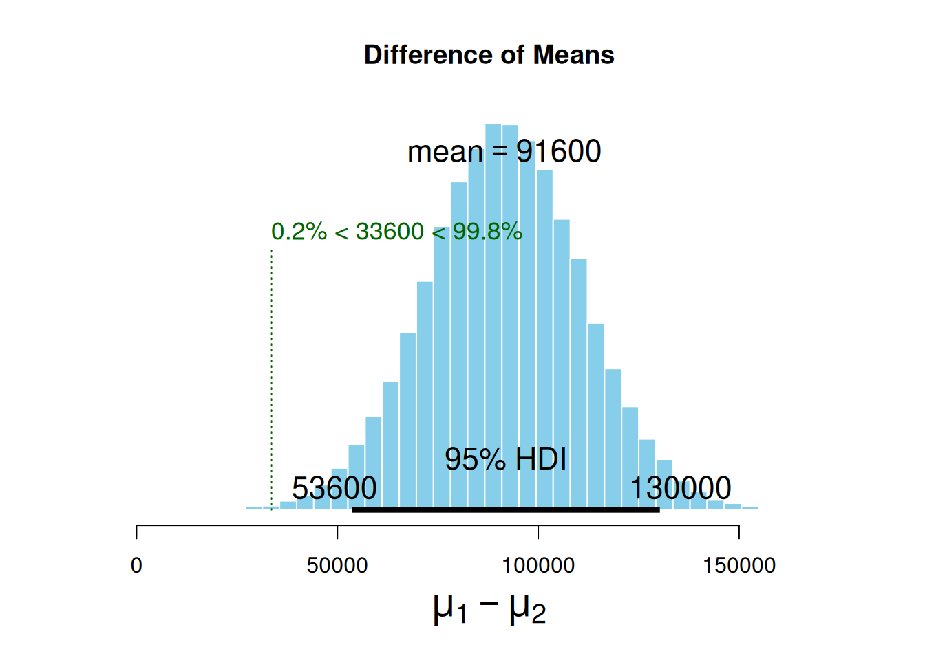
The mean difference between the estimated parameters distribution is 91.6k sold bottles. Also, note we set compVal as 5% of pre-pandemic sales. This comparison value is also called the region of practical equivalence (ROPE), a value of difference good enough for practical purposes. We have observed that the ROPE we set up (which denotes an increase of at least 5% in the number of bottles sold) does not reach the HDI range. The HDI lower margin left out the ROPE, which indicates that alcohol sales have, in fact, gone up by more than 5% during the pandemic. It is worth noting that the ROPE serves as a boundary around the null value (which is zero, meaning no observable effect). If you want to learn more about ROPE interpretation and this kind of inference, please revisit (2018).
Now, let’s look how many times (in average) the alcohol consumption increased during the pandemic.
plotPost(BESTout$mu1 / BESTout$mu2,
         xlim = range(BESTout$mu1 / BESTout$mu2),
         showCurve = FALSE,
         credMass = 0.95,
         xlab = bquote(mu[1] / mu[2]),
         cex.lab = 1.75,
         main = "Proportional Increase",
         mainColor = mainColor,
         comparisonColor = comparisonColor,
         ROPEColor = ROPEColor)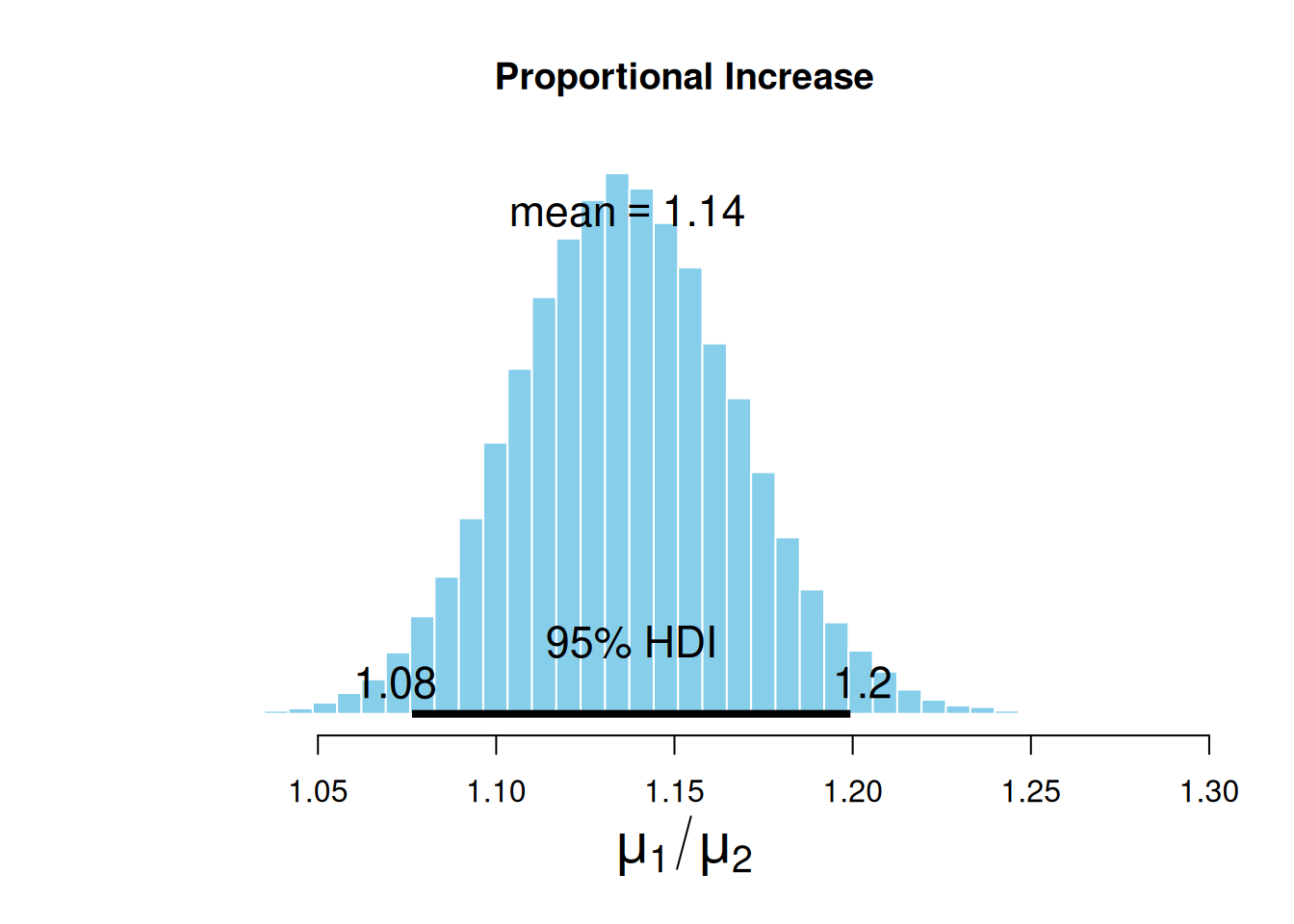
On average, the sales increased by 14%, but if we want to be conservative, we can use the low margin of the HDI and say that during the pandemic, alcohol sales increased by at least 8%.
Wrapping up our pandemic’s effect question
It seems that, during the pandemic, there was an actual increase in the alcohol intake by the population. This is no surprise since we saw several reports about this. Still, estimating the pandemic effect using public data is certainly a good exercise for data scientists.
Final remarks
Wow, that was an extensive tutorial. I hope you have enjoyed it :)
Here, we explored REAL data, made publicly available by the Iowa Government. We did lots of data wrangling, time series analysis, and visualizations, and concluded with some statistical inference. Now, we know a little more about alcohol consumption dynamics and how to generate new information in the field of alcohol retail sales.
Congratulations!

You made it to the end of this tutorial! Thank you for investing your time in reading it. I sincerely hope that you have found it both entertaining and helpful.
If you have any feedback, please don’t hesitate to share it with me. I’m always looking for ways to improve and provide better assistance.
Acknowledgements
This small tutorial wouldn’t be possible without Little Mai, my home office manager and data science bestie! She’s always got my back when my gradients won’t converge 💕

And, of course, Eric Vargas, who reviewed this material exhaustively before being published. Google, hire this man; you don’t know what you’re missing! ;)
References
Hyndman, Rob, and George Athanasopoulos. 2021. Forecasting: Principles and Practice. 3rd ed. Australia: OTexts. https://otexts.com/fpp3/.
Kruschke, John. 2013. “Bayesian Estimation Supersedes the t Test.” Journal of Experimental Psychology 142: 573–603. https://doi.org/10.1037/a0029146.
Kruschke, John, and Torrin Liddell. 2017. “The Bayesian New Statistics: Hypothesis Testing, Estimation, Meta-Analysis, and Power Analysis from a Bayesian Perspective.” Psychonomic Bulletin & Review 25: 178–206. https://doi.org/10.3758/s13423-016-1221-4.
Kruschke_, John. 2018. “Rejecting or Accepting Parameter Values in Bayesian Estimation.” Advances in Methods and Practices in Psychological Science 1 (May): 251524591877130. https://doi.org/10.1177/2515245918771304.
Molak, Aleksander. 2023. Causal Inference and Discovery in Python: Unlock the Secrets of Modern Causal Machine Learning with DoWhy, EconML, PyTorch and More. 1. ed. Birmingham: Packt Publishing.
Pearl, Judea, and Dana Mackenzie. 2018. The Book of Why: The New Science of Cause and Effect. New York: Basic Books.
Peña, Edsel A., and Elizabeth H. Slate. 2006. “Global Validation of Linear Model Assumptions.” Journal of the American Statistical Association 101 (473): 341–54. https://doi.org/10.1198/016214505000000637.
Footnotes
I highly recommend following Jason’s material if you’re pivoting into data science.↩︎